top of page
SF.GO is a unified travel app
that brings together details
of one’s itinerary for past,
present and future trips.

CHALLENGE
SOLUTION
Create a visually unified information design system with multiple touch points for a smart city application.
There are many logistical challenges with travel: flight schedules, dinner reservations, local transportation, event and other sightseeing details to manage. SF.GO organizes and presents all of your plans in the palm of your hand.
Anchor 2
WHERE YOU'RE GOING
The app assists users from itinerary overview to individual event. It guides the user from one location to the next, and offers assistance navigating MUNI – buying a ticket using Wallet and guiding which stop to get off for ones destination.
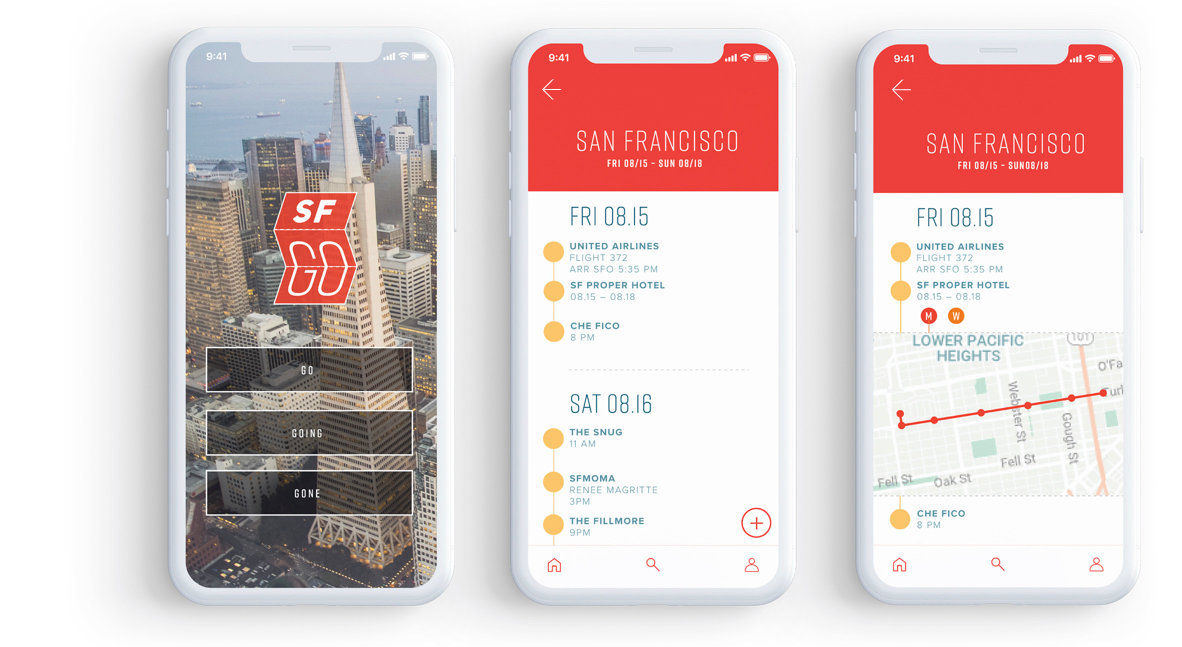


SF.GO also works on your other devices to further aid in navigation of your journey.
GO INTERNATIONAL
Linked to other cities, SF.GO offers the same itinerary management and assistance, as well as similar travel packages, and is an indispensable tool for travelers around the world.


GO. GOING. GONE.
With SF.GO, you are able to manage your travel in order to review your past trips, spending and travel trends.

SF.GO also offers travel packages for people who prefer to have their itinerary planned for them.

Anchor 1
SF.GO Design Process
RESEARCH
SF.GO started with man on street research. I spoke to both locals who used public transportation regularly, and those that didn’t, as well as visitors to the city and drivers of public transportation. They shared their experiences of BART, MUNI, ferry, bike share, car share. I had found that people traveling wanted quick access to their complete itinerary – from flight information to reservations to events.

COMPETITIVE ANALYSIS
In doing competitive analysis in the travel app space and various 2x2’s, I found many transit and travel apps presented relevant information for only one specific mode of transit and also lacked a voice and friendly relationship with the user.

JOURNEY MAP
Shows the moments-of-delight and pain-points of a non-resident visiting the city during a day getting around SF. Important information to convey were illuminated: public transportation schedules, reservations, reviews and a need for various touch-points.

USER FLOW

WIREFRAMES
Wireframes and user flows for the various touchpoints play with different gestures for accessing data on the phone. Using an open-pinching motion reveals a map and transit options to assist getting from one event to the next.

LOGO
I sketched in a 10x10 grid to come up with a direction for the logo that was in the form of a map, in reference to the way-finding of the SF.GO system. Iterating on that concept to led to the final logo.

BRANDING


TAKE AWAYS
By organizing and simplifying the travel experience, SFGO takes away the worry of trip and itinerary management and allows people to fully experience and enjoy their travel in a new city. In many ways, I feel that SF.GO is in keeping with my goals as a designer by creating a better quality of life for the user.
bottom of page